
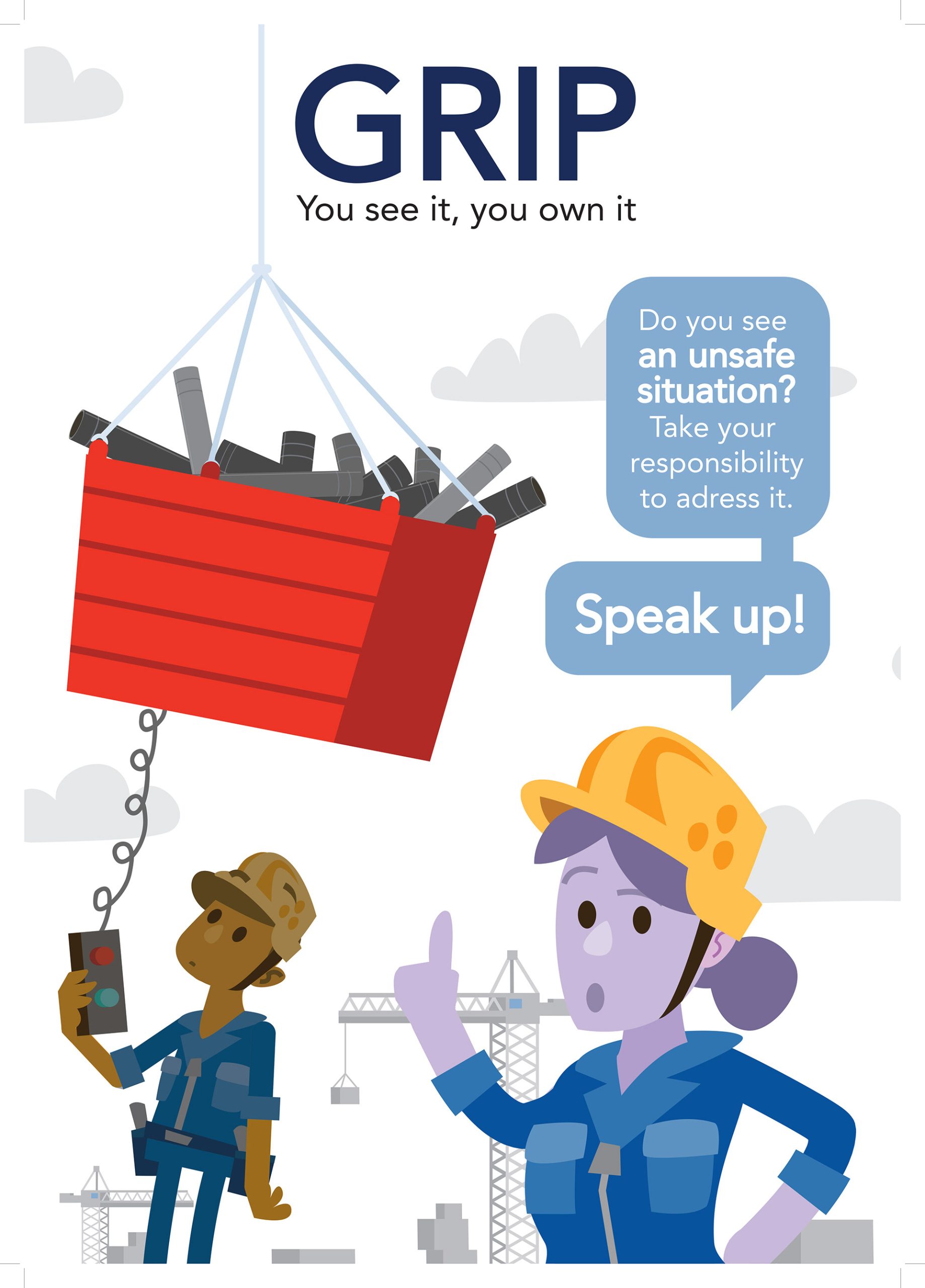
Damen Shipyards has shipywards all over the world where they build and repair ships. Vietnam, China, France and even in the Netherlands. One problem they kept encountering was “safety”. How do we instruct the working force on working safely, in different cultures and languages?
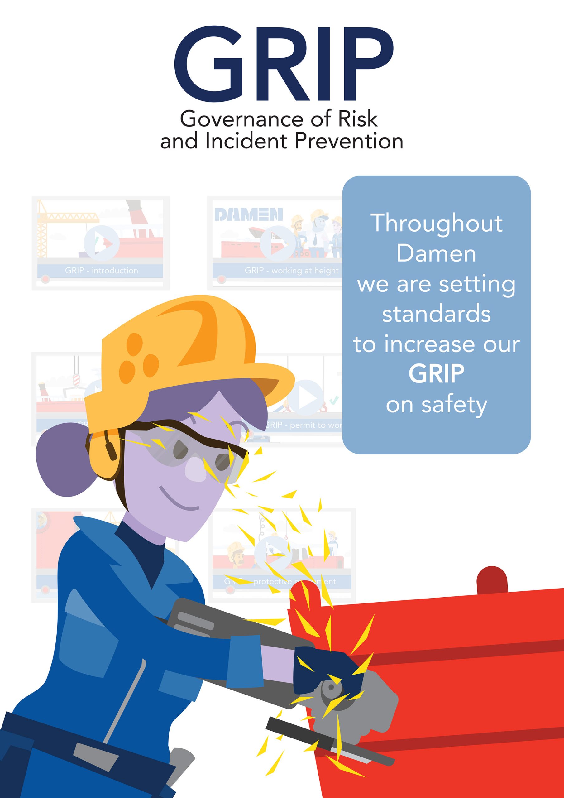
With this in mind a set of characters was developed that, with their more cartoonish skin colours, would appeal to all ethnic groups. These characters would then be used across different posters, animations and other forms of communications as part of the GRIP on Safety campaign which we helped develop.
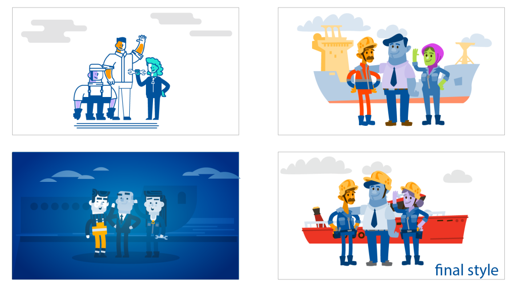
First the existing branding was analysed and I sat down with their own designers and art directors to get a feel of what Damen stood for. Based on this information I briefed the character designer. The 3 sets of character styles shown above were the result.
After some back and forth discussion with the client, one style was chosen and tweaked. For instance the ship was changed to one familiar among the staff and the colors were made a bit more nuanced with shades of blue complimented with the yellow in their hats.
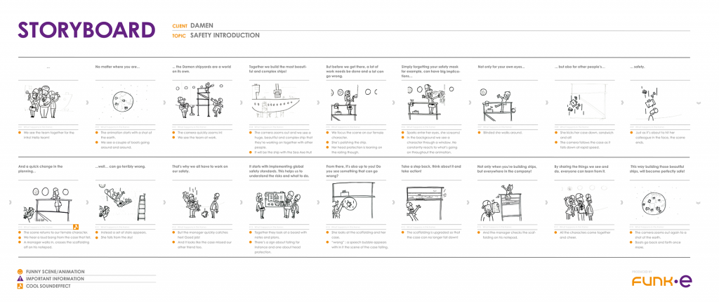
With the designs set we went to storyboarding! Each animation got it’s own storyboard which was made after a a two hour session with the client. This eventually led to this series of animations and posters.
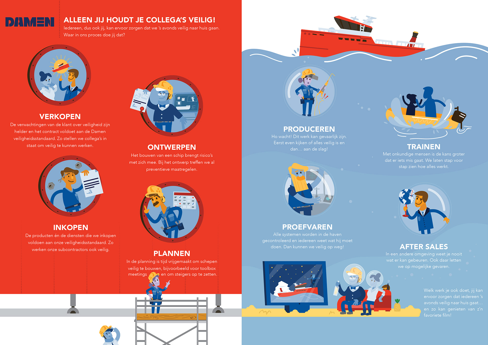
An infographic designed and illustrated by myself for use in the internal-communications magazine published by Damen itself. I focussed on making a strong visual distinction between both pages when it came down to color while also keeping the visuals interesting to look at. For instance by using the design of a ship or playing with the underwater theme near the end.