
Woord&Daad does a lot of good for poor people abroad, but they are mostly known for having a system in place that lets people help other kids go to school. The downside is that they do so much more, and nobody knows!
The goal of this animation, and later poster series and images, was to show the world just what Woord&Daad does.
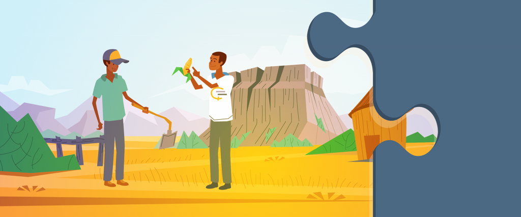


One visual element that was already in place in their branding was the puzzle piece. Woord&Daad connects all sorts of companies and organisations across the world to make their work possible. We grabbed this visual element and tried to put it to use in our visual style development. Above you can see 3 designs.

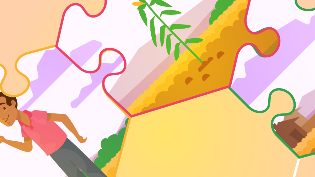

The final style was built around using the puzzle pieces as scene transitions. Each scene took place in a single puzzle piece and during transitions and in the end we would see the ‘big picture’.